You’ve probably heard the phrase “Knowledge is power.”
Well, that is absolutely true when it comes to your website.
Without in-depth knowledge of what’s happening on your website, you’re basically flying blind. You don’t know how people are finding your site. You don’t know what they’re doing once they get there. And you don’t know which visitors are buying which products.
In other words, you’re powerless to actually improve your website’s performance… because you don’t know what’s working and what isn’t.
That’s where Google Analytics comes in.
When you know how to use it, Google Analytics can tell you SO MUCH about your website and the people on it. Who are your users? Where are they coming from? What actions are they taking?
This is the kind of information (power) you need to make smart, informed decisions to grow your profits and your business.
But for many people, Google Analytics can seem overwhelming. Confusing. Complicated.
And that’s especially true if you’re a beginner and you don’t know where to start.
That’s why I’m writing this post.
You’re about to learn the 3 Google Analytics reports that give you the most bang for your buck—so you can gain the most valuable insight into what people are doing on your site, in the least amount of time and effort possible.
By the time you’re done, you’ll know how to use these 3 reports to get a quick snapshot of your overall website performance. You’ll also have a few tricks you can use to drill down and get more focused data that you can use to bring in more sales and revenue from your website visitors.
NOTE: Throughout this post, I’m going to be showing you a lot of screenshots. These screenshots come from the Google Test Account, which is a publicly available analytics account you can use to play around and learn more.
If you don’t yet have a Google Analytics account—or if you don’t have much data yet—feel free to open the test account in a separate tab or on a second monitor. If you do have a Google Analytics account, open your own dashboard instead.
Either way, you’ll get the most benefit from this post if you follow along at home as you read. So let’s get started.
Google Analytics Report #1: Source/Medium Report
In my opinion, this is the most important report in Google Analytics.
It gives you an actionable, high-level overview of your website’s performance broken down by traffic source.
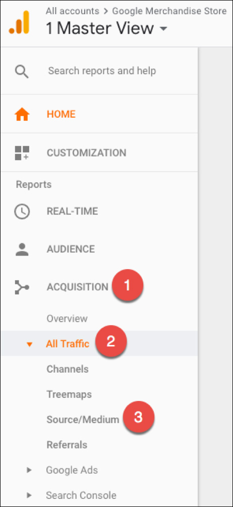
You’ll find it under the “Acquisitions” tab, which contains all the reports that tell you about how people are getting to your website (How you are “acquiring” your traffic).
To find it, first click “Acquisition,” then “All Traffic,” then “Source/Medium”:

For the moment, you can ignore the graph at the top of the page. Instead, you’ll want to scroll down to the table—this is where you’ll find the real meat of the report:

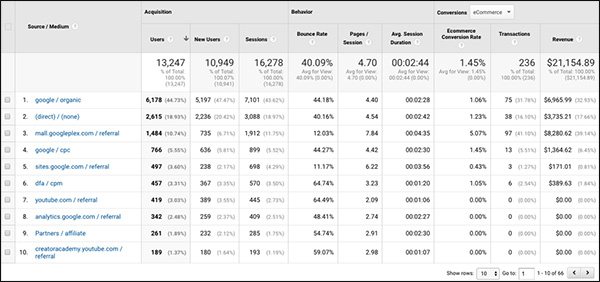
This table shows you all the different traffic sources for your website along with the performance details for each source. So you can see things like…
- The identity of each traffic source and how many users they are sending you
- How engaged those users are on your site
- What bottom line results are each of those traffic sources producing (measured by purchases and/or goal conversions)
You want to look for anomalies. Things that stand out.
So what should you be looking for here?
In general, you want to look for anomalies. Things that stand out.
We have a saying at our company, “The truth is in the trend, the power is in the pattern.”
For example…
Knowing that your site has a 46% bounce rate is not particularly helpful. But if you know that YouTube traffic has a 58% bounce rate and email traffic has a 13% bounce rate—that is, almost 5x higher… well, that could be a useful thing to know.

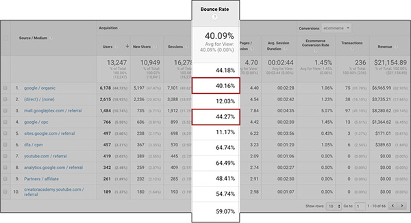
This tells you that people coming from email are much more likely to engage with your site and visit more than 1 page. Once you know that, you can go about making changes to improve your website’s performance—perhaps by prioritizing email over YouTube. Or perhaps by creating a new landing page made specifically for your YouTube visitors.
Another thing I love about this report is that it shows you the big picture. You can see your overall results in terms of sales and revenue from each traffic source:

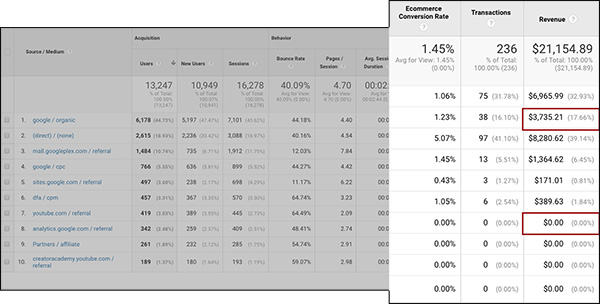
This reveals that even though YouTube is your second-highest source of traffic, it doesn’t bring you any sales. On the other hand, deal sites are your #1 source of revenue—despite the fact that they bring you far less traffic.
The Importance of Tagging Your Traffic
In order to get the most insight from this report, it’s essential to tag your traffic.
Here’s why:

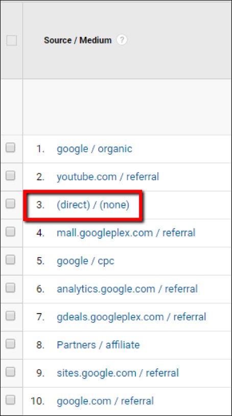
See that “(direct) / (none)” traffic source?
Anytime someone comes to your website and Google Analytics can’t figure out how they found you, that’s where Google puts them. Inside the “(direct) / (none)” source. Basically, Google doesn’t know if those visitors typed your URL directly into their browser, or if they clicked on an untagged link. And if they did click on a link, there’s no way to know which link they came from.
Basically, (direct) / (none) is like a black box. And as you might imagine, having a black box in your analytics is not very useful…
Fortunately, you can reduce the amount of (direct) / (none) traffic in your Analytics account by tagging your links.
By tagging your links, you’re letting Google know where your traffic is coming from. This gives you better insight into ALL your traffic sources and generally makes it easier to organize your analytics reports.
To tag your traffic, you simply add a bit of code after your website URL anytime you link back to your site. Here’s what it looks like:
https://yourwebsite.com/?utm_source=newsletter&utm_medium=email&utm_campaign=widget
If you tag your links like this, then the traffic that comes from that link will no longer show up as (direct) / (none). Now, it will show up in Google Analytics with a source of “newsletter” and a medium of “email.”
You definitely want to get in the habit of tagging your traffic at all times. It’s not hard to do once you get the hang of it. One easy way is to use Google’s Campaign URL Builder.
Now some people don’t like using tagged URLs because it makes the link itself look longer and uglier. After all, yourwebsite.com is a lot simpler and nicer-looking than:
yourwebsite.com?utm_source=newsletter&utm_medium=email&utm_campaign=widget.
But here’s a trick for getting around that: use a link shortener (like bit.ly) to effectively hide the UTM parameters.
To do this, just create your tagged URL. For example:
https://measurementmarketing.io/?utm_source=digitalmarketer&utm_medium=guest-post&utm_campaign=academy&utm_term=office-hours&utm_content=office-hours
Then use a link shortener to create a new URL that redirects visitors to that longer, tagged URL. For example:
Try clicking that link and then looking at the URL at the top of the page. You’ll see the UTM parameters are there, even though you can’t see them in the shortened version of the link.
(RELATED: Get back to the basics of Google Analytics with The Complete Guide to Google Analytics Campaign Tracking)
Google Analytics Report #2: Landing Pages Report
The next report you’ll want to monitor on a regular basis is the Landing Pages report.
Now when people talk about landing pages here at DigitalMarketer, they’re often talking about a specific type of page—like an opt-in page that’s designed to generate a new email subscriber.
But Google Analytics defines a landing page a bit differently. To Google Analytics, a “landing page” is the first page that someone sees when they visit your website.
So if someone’s visit goes like this:
Homepage → Category Page → Product Page → Exit
Then the homepage was the “landing page” for that session. Another visit might go like this:
Blog Post → Homepage → About Us Page → Exit
In this case, the blog post was the landing page—because that’s the page they first landed on when they reached your site.
When you start combining the insights from these different reports, that’s when you start to glimpse the really awesome power of Google Analytics.
Make sense?
Great!
And what’s really cool about this report is that it breaks out all the sessions people had on your website into the landing pages that initiated those sessions. In other words: it shows you which pages people are seeing FIRST. Then it allows you to compare the performance of those pages to see which landing pages are doing the best job of engaging your visitors.
It’s located in the “Behavior” tab, which contains a bunch of reports that give you better insight into the behaviors people are taking on your website.
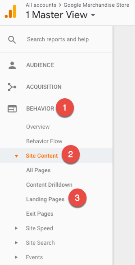
To find it, first click “Behavior,” then “Site Content,” then “Landing Pages”:

And once again, the meat of this report lies in the table farther down on the page.
The leftmost column in that table lists all the different landing pages on your website:

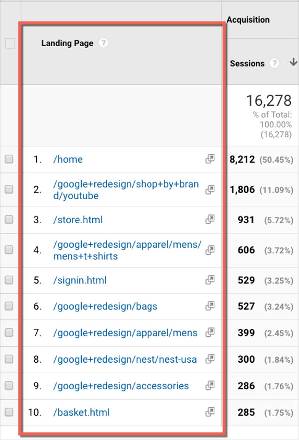
Remember, these are the pages that people arrive on FIRST when they visit your site.
And when you start to look at the engagement metrics of these landing pages, you can learn some really interesting things.
For example, if you look at the bounce rate, you’ll find that some landing pages do a much better job of engaging your visitors than others:

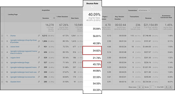
The sixth landing page in this table has a much higher bounce rate than your other landing pages; it’s more than double the bounce rate of the fourth landing page.
You’ll probably want to take a look at that page with the high bounce rate and see if you can figure out why people are bouncing when they come to it. Maybe it’s missing a menu, or maybe the content doesn’t do a good job of addressing what the visitor is looking for.
2 other metrics you’ll want to look at are Pages / Session and Avg. Session Duration. These can also reveal insights into how well your landing pages are performing.
For example, the fourth page in this table does a much better job of engaging visitors than the second:

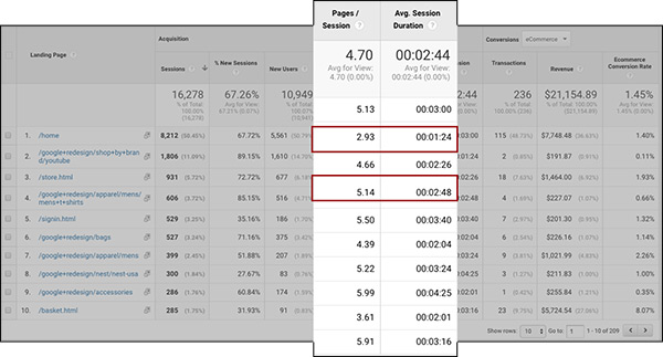
This is another example where you’ll want to take a look at the high- and low-performing pages to see what you can learn (And more importantly, what you can do to leverage the high-performers and improve the low-performers).
Now that’s all really cool, useful stuff you can uncover in this report.
But when you start combining the insights from these different reports, that’s when you start to glimpse the really awesome power of Google Analytics.
How to Segment Your Report by a Secondary Dimension
Remember that in report #1, you learned how to analyze your website by looking at each traffic source individually.
We’re in a different report right now, but you can still apply Source/Medium to this report using a secondary dimension.
In simple terms, what this does is allow you to analyze all your landing pages, broken out by traffic source.
That might be kind of hard to conceptualize, so let’s just go through an example to make this a little easier to understand.
To apply a secondary dimension, just click “Secondary dimension” above the table. Then click in the search bar and type “source.” Finally, click on “Source / Medium” to apply that segment to the table.

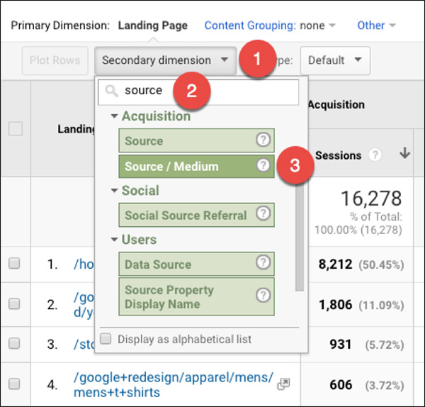
You’ll notice that this has added another column to the table: the “Source / Medium” row:

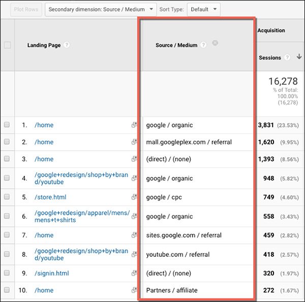
Now you can see the performance of each landing page, broken down by traffic source. For example:
In the table below, row 1 shows all the data from sessions starting on /home and coming from organic Google traffic. Row 6 shows all the data from sessions starting on /home and coming from Adwords (Google CPC):

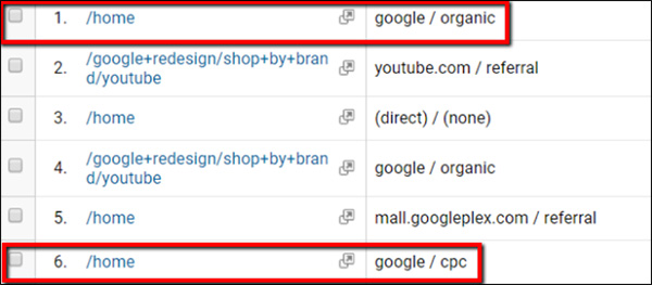
And if you want to dig down and focus on 1 particular landing page, you can click on it in the table:

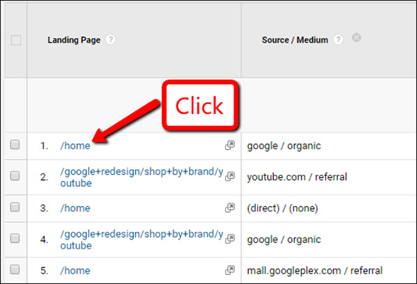
Doing this will show you only that particular landing page, so you can compare all the traffic sources going to that page. Like so:


I LOVE doing deep-dives like this because this is where you can learn some really useful information. For example, if you take a look at that table you’ll see that even though organic traffic accounts for the most visits to your homepage… it does NOT result in the most revenue.
Instead, the traffic sources linking to your homepage that create the most revenue are rows 3 and 4 (email and deal sites):


Knowing this, you might realize you want to do things a little differently. For instance, you might decide to change your homepage so that it speaks more directly to people coming from emails and deal sites.
One Last Thing to Keep in Mind
There’s one thing I want to make sure you realize: this report shows you the data from your users’ ENTIRE session.
To understand what that means, first you have to know what Google Analytics means by a “session.” A session is essentially a “visit.”
If you visit a website and browse around for a few minutes, then leave, that was 1 session. If you come back the next day and browse around some more, that’s another session.
And the Landing Pages report shows you what happens during the entire session—NOT just what happens on the landing page itself.
For an example of what that means, take a look at this column of data:


This section shows 243 transactions with /home as the landing page.
But those transactions didn’t occur ON the homepage itself. Instead, they most likely occurred AFTER the person landed on the homepage and then navigated to a different page (Probably a product page, then a checkout page, then a confirmation page).
For example, 1 session might have gone like this:
Homepage → Product Page → Shopping Cart → Order Confirmation Page
Another session might have gone like this:
Homepage → Features Page → Product Page → Shopping Cart → Order Confirmation Page
The point is that those 243 transactions didn’t necessarily occur ON the homepage. But they did occur during sessions that BEGAN on the homepage.
(RELATED: Want to shape up your landing pages to get better engagement? Check out our 15-Point Landing Page Audit that you can download for FREE!)
Google Analytics Report #3: Product Performance Report
The last report you’re going to want to keep a close eye on is the Product Performance report. And this one gives you a detailed view into your ecommerce sales broken out by product.
It’s located under the “Conversions” tab, which contains all the reports that dig into the goal conversions happening on your website.
To find it, first click on “Conversions,” then “Ecommerce,” and finally “Product Performance.”

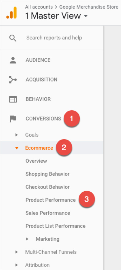
You’ll notice that this table is broken down by product, allowing you to view sales performance for all the different products for sale on your site.

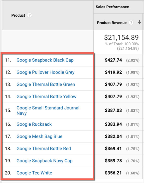
Here you can see, at a glance, how much revenue you generated from each product. You’ll also see your sales broken down by quantity, average price, refunds, and more.
This is another high-level report that can reveal some important insights if you simply look for the things that stand out.
Another thing you can do is to compare “Unique Purchases” and “Quantity” to get an idea of how many people are purchasing multiple copies of a product. In this table, you’ll see that in row #2, everyone purchased exactly 1 copy of the product (8 sales, 8 units sold). But 2 rows lower, you had 7 purchases resulting in 21 total units sold—which means people are buying more than 1 at a time.

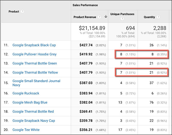
This gives you even more insight into the buying habits of your website visitors, which you can use to better optimize your site for more purchases and revenue.
You Can Segment This Report, Too
And once again, you can segment this report by a secondary dimension to get even more focused data.
You can segment by source/medium to find out which traffic sources are resulting in the most sales of each product:


Digging down into the data, you might notice that your top-selling product brings in 10x more revenue from deal sites than it does from organic traffic:

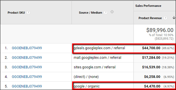
In this case, you might want to spend less time on SEO and more time on getting featured on more deal sites.
You can also segment by landing page to find out which landing pages are resulting in the most sales of each product:


You may notice, for instance, that your buy-to-detail rate is highest when the landing page is /basket.html:


And that makes sense when you think about it. If someone’s session begins on /basket.html, they’re probably coming from a shopping cart abandonment campaign of some kind. So you would expect to see a high conversion rate from those visitors.
Applying these secondary dimensions can reveal some really useful insights. For instance, which traffic sources or blog posts are leading to the most sales of your best-selling products? Do people coming from YouTube buy the same products as people coming from PPC? What products do people usually end up buying when they arrive on a certain category page?
When you know the answers to questions like that, you can start to drive more traffic through your best sources—and to your best landing pages—to increase your sales even more.
Start with ONE Thing
Google Analytics can be really overwhelming at first.
(Don’t feel bad. It was the same way for me and everyone else I’ve ever known.)
But there’s something you can do to minimize or even avoid feeling overwhelmed:
Start with just ONE thing.
Part of the reason why Google Analytics seems so complex is because people start clicking around and looking at a dozen different reports at once.
That’s a sure-fire road to confusion, frustration, and overwhelm.
But if you look at ONE report at a time, and just focus on making sense of what that one report is telling you…
…then you can start to learn useful information right away.
Then, AFTER you’ve mastered that first report, you can move on to another.
Then another. Then another.
And the cool thing about Google Analytics is that each time you learn how to use a new report, you’ll also understand how to use that dimension as a “secondary dimension” to segment other reports.
So… Don’t be in a hurry. Don’t try to figure it all out at once.
Just start with one of the reports in this post (personally, I’d suggest the Source / Medium report), and take your time figuring it out. Then move on when you’re ready.


