CHAPTER
07
Applying Website Analytics to Your Digital Marketing
What's your emotional reaction when you hear the word, data?
Stress? Fear? Frustration?
Fortunately, data and analytics don't have to be scary. In fact, it can be fun (or at least interesting) if you know how to turn all those numbers and reports into actionable intel you can use to grow your business.
In this chapter, you'll learn the methodology for doing analytics and data in your business, the metrics that matter most, the lingo you'll use to talk about it, and the teams or roles that should be responsible for it.
But first, let's talk about why data and analytics are so important to a successful business.
Why Data Matters
Data comes in two flavors: not enough and too much.
The challenge most people struggle with is how to turn numbers into meaningful decisions. Static numbers, in and of themselves, are meaningless.
So why would you want to do analytics?
To understand the answer, let's review some examples:
The Oakland A's Athletics Club
Billy Beane took over as the General Manager of the Oakland A's in 1997. There, he applied statistical analysis (known as sabermetrics) to players, radically changing the way they acquired players.

Billy Beane, General Manager of the Oakland A's (Source)
Beane's approach was to focus on specific metrics, such as batting and runs, to find undervalued players no one else was noticing. This approached made the Oakland A's one of the most cost-effective teams in baseball and carried them through 20 consecutive wins, playoffs, and even the world series.
Essentially, data made the A's competitive with much bigger clubs while working on a budget a third of the size.
Netflix
Netflix's core belief is that customization wins customer loyalty, a belief that puts data at the center of their corporate strategy.
When they were still a DVD rental company, Netflix invested heavily in data mining technology to develop a movie recommendation algorithm, leading the way in using data to provide a great customer experience. And it worked. Recommendations drove 50% of their traffic.
After adopting a streaming model, this data-first approach continued, and it's made them one of the top streaming video-on-demand services available.
Today, it's giving them the customer insight they need to create massively successful original content like Daredevil, Stranger Things and Orange is the New Black.

Netflix data gives them the insight to develop massively successful content. (Source)
None of this would have been possible without data.
DigitalMarketer
We're no strangers to data either. I'll get into more detail later in this chapter, but here at DM, we rely on data to help us make business decisions that are all but guaranteed to work.
Our belief? Gut instincts may be good, but data never lies.
The challenge, of course, is in your methods. How do you go from the spreadsheet to strategic decisions that grow your business? Let's take a look.
The Methods of a Well-Executed Analytics & Data Strategy
To master analytics and data, you need to master 3 guiding principles:
- Give data a job. This is the foundation of data analysis. Every piece of data you gather should help you answer questions and make smart decisions.
- Use hypothesis testing to convert questions into strategies. This is what makes data meaningful. It's the process of transforming raw data into business decisions.
- Apply context to account for the unmeasurable. Some things are hard to measure. For those situation, you need to contextualize the data.
Analytics and data shouldn't be stressful. But it's easy to feel that way when there are so many sources to draw from, each formatting the data differently, sometimes even giving different numbers for the same metric.
Where do you put your attention? How to compare the data from different sources?
To start, give your data a job.
Principle #1: Give your Data a Job
One of the easiest ways to understand data is to think of the marketing funnel.
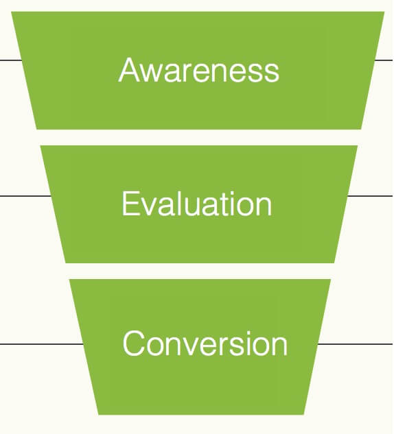
The marketing funnel
This is a foundational concept that makes it easy to visualize customer acquisition in marketing. Your brand marketing creates awareness and attracts new visitors to your website. Some of these new leads will be interested enough to evaluate your business and products, and a percentage of them will go on to become customers.
For sales, that's a good model, but we need to tweak the funnel to work as well for analytics and data.
This model is a funnel metrics flowchart that not only maps the stages of a customer's journey, it also lists the metrics that should be measured at each stage.
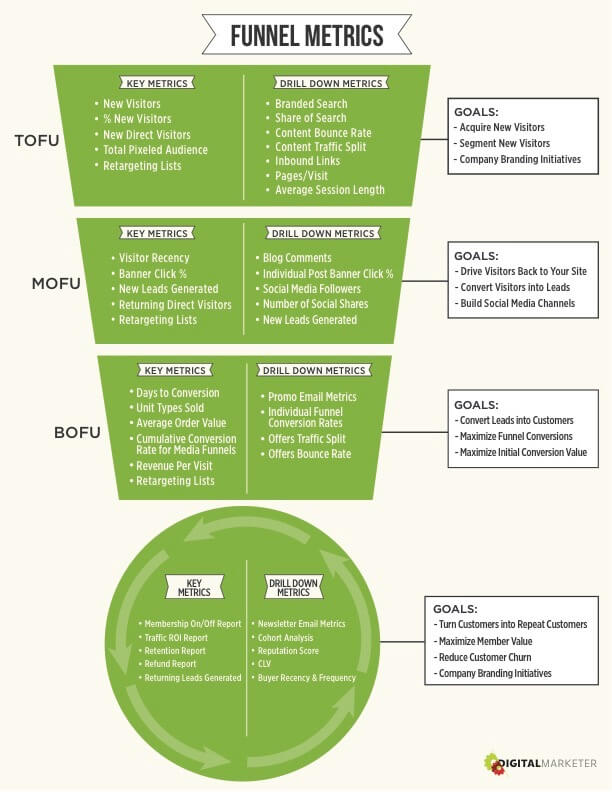
Funnel Metrics Flowchart
With this approach, we use the same 3 phases of the funnel but rename them like this:
- TOFU, or top of funnel, is the awareness phase
- MOFU, or middle of funnel, is the evaluation phase
- BOFU, or bottom of funnel, is the conversion phase
But we don't want to stop there. We also need to measure what happens after someone becomes a customer.
So we add one more stage: the post-conversion phase, which focuses on how customers can be turned into repeat customers, life-time subscribers, and advocates for your business.
This is how you give your data a job. You don't look at all your data at once. You assign different metrics to each stage of the funnel.
Rather than measuring your business's health only by its bottom-line numbers, you measure its health at every phase—identifying leaks in your funnel, finding strategic ways to plug them up, and making it easier to convert.
To begin, let's identify the funnel metrics you need for each stage of your customers' journey.
Categorizing Data by The Stage of the Funnel
TOFU (Top of Funnel)
Your goal for this stage? New visitors.
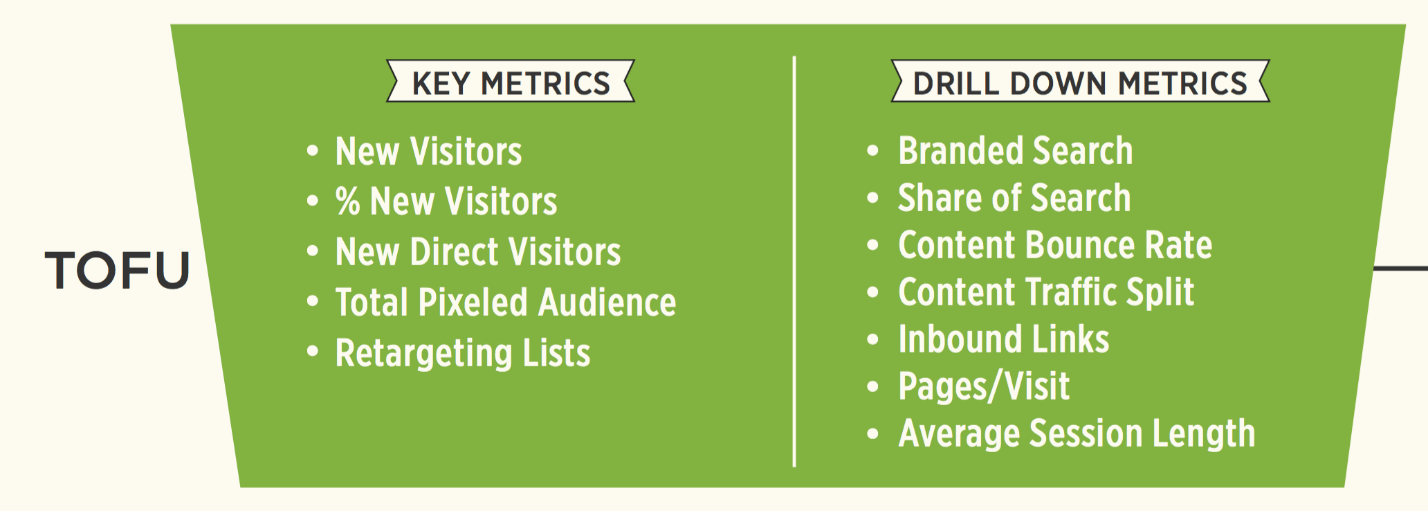
Top-of-the-Funnel metrics
The key question when choosing metrics for this stage is this: Does this metric give me insight into brand-new visitors?
A good example of a TOFU metric: Direct new visitors.
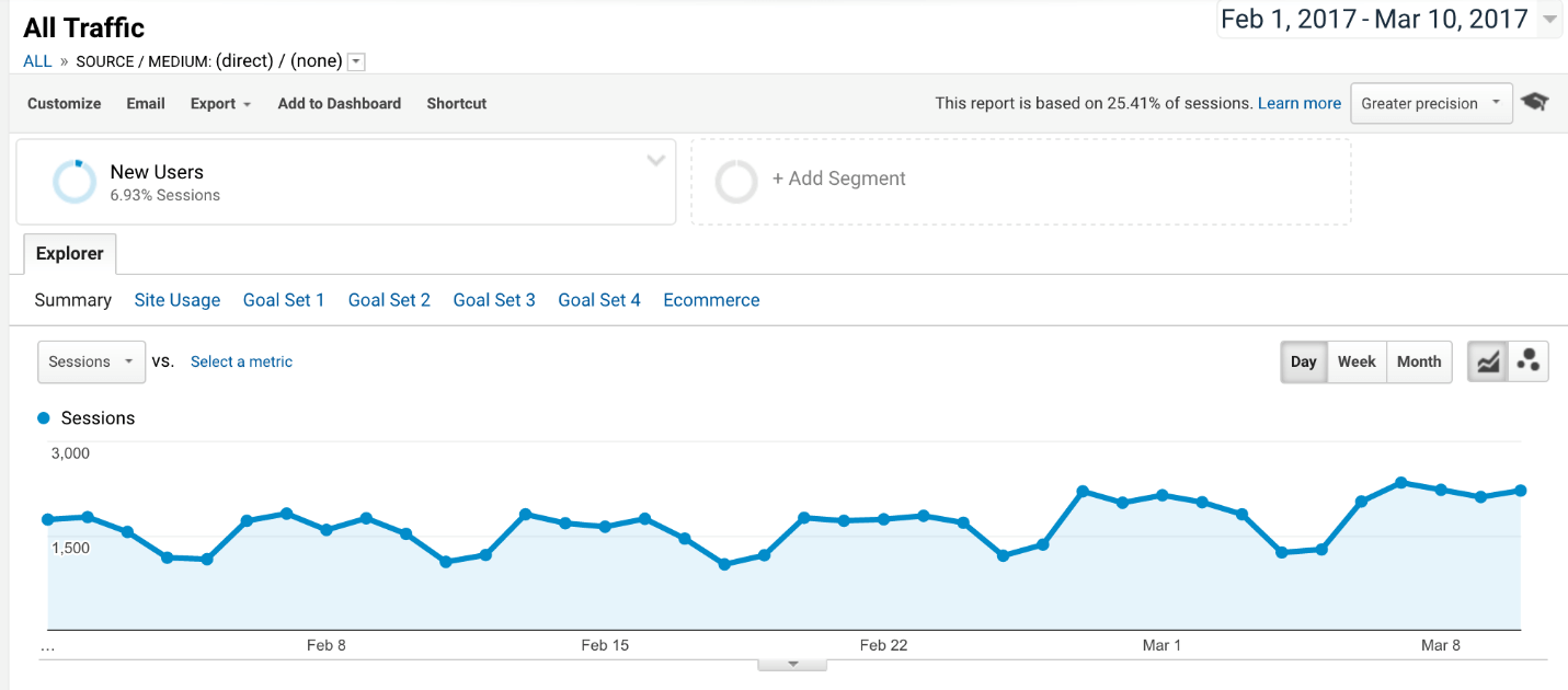
Direct new visitors is the number of people who are typing your website URL directly into Google? It can measure the effectiveness of online and offline advertising:
- If you've been running awareness ads, you should see spikes from people trying to learn more about you.
- If you have billboards that include your URL, you should see a spike in the geo-areas surrounding the billboard as they visit your site.
MOFU (Middle of Funnel)
Your goal at this stage? Converting new visitors into leads.

Middle-of-the-Funnel metrics
Your guiding question when deciding whether a metric is right for the middle of the funnel is this: Does this metric give me insight into how well I'm getting visitors to commit?
"Commitment" can be defined as:
- People subscribing
- People filling out a webform
- People following you in social media
It's about people giving you permission to reach out to them and offer more value.
A good example of a MOFU metric: CTA clicks.
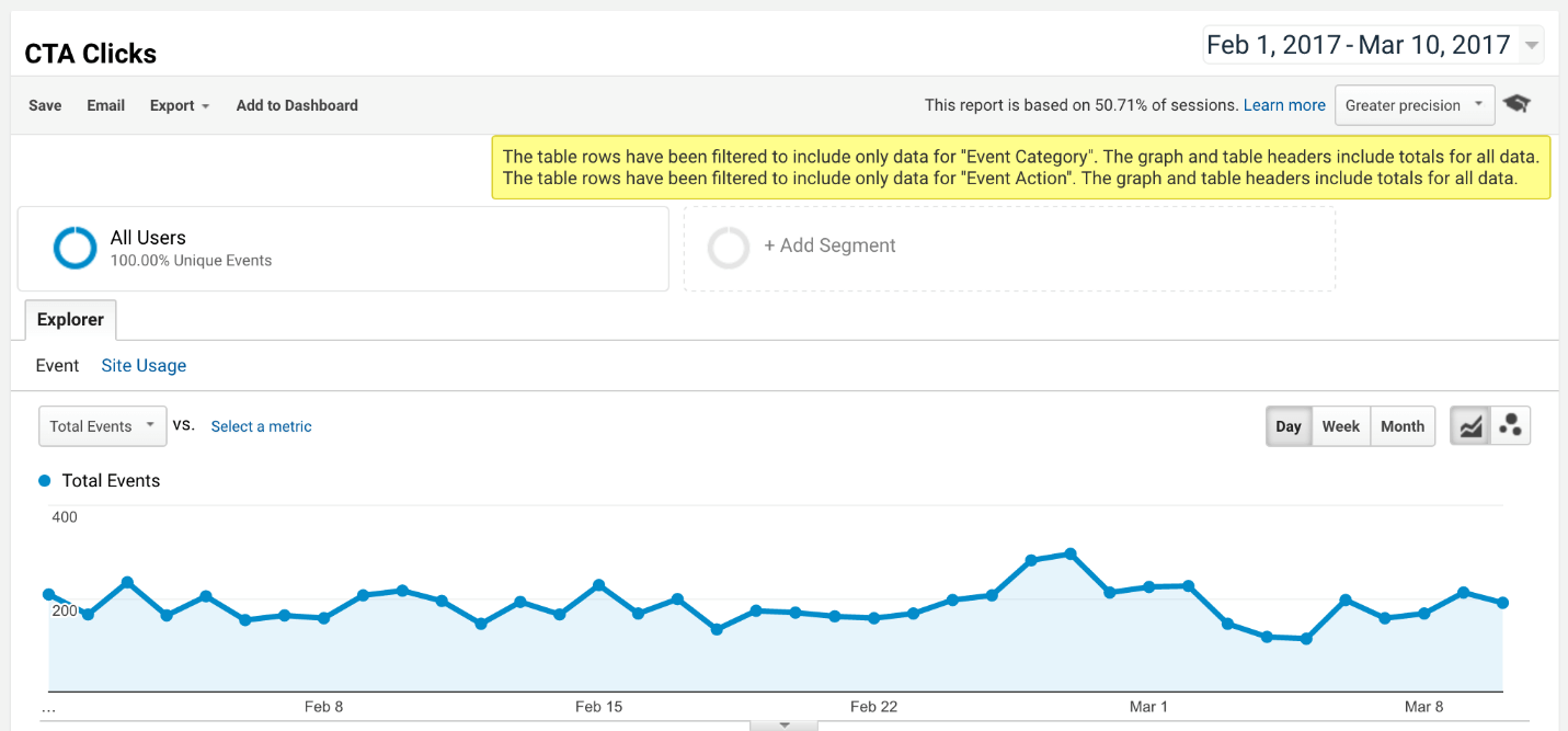
If you have a blog post with a banner to learn more about one of your products. You need to know how many clicks that banner is getting and what percentage of your blog visitors are clicking so you can evaluate how well your content is converting visitors into leads.
BOFU (Bottom of Funnel)
Your goal? Converting prospects into customers.
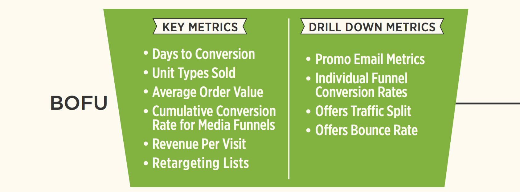
Bottom-of-the-Funnel metrics
Your guiding question when choosing metrics for this stage: Does this metric give me insight into how well prospects convert into customers?
This stage is especially important because, once someone buys something from you—even something small and inexpensive—the likelihood that they'll buy again increases 10-fold, and their willingness to invest in the relationship significantly increases.
A good example of a BOFU metric: conversion percentage.

How many people clicked or purchased from a brand communication? This tells you which offers are working and what kind of offers you should make to new customers.
Retention & Monetization (After Conversion)
Your goal for this stage? Customer satisfaction. You want to increase membership, traffic ROI, retention, and customer lifetime value.
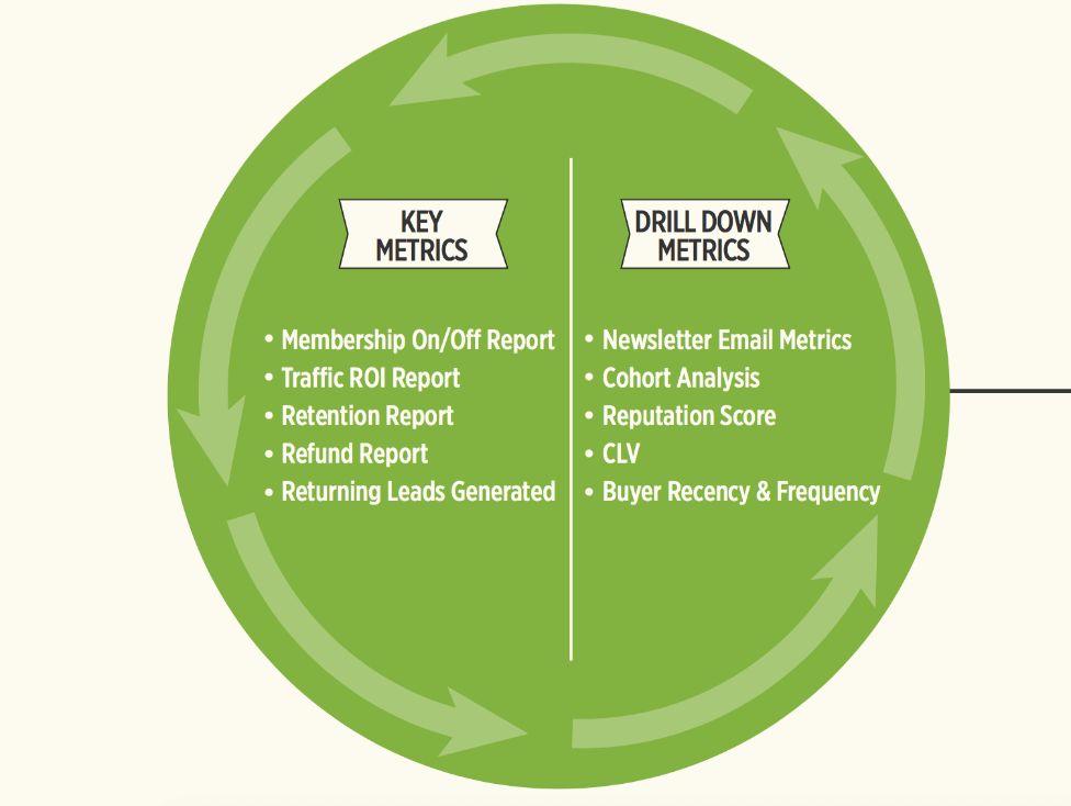
Post-Conversion metrics
The guiding question when looking at post-conversion metrics: Does this metric give me insight into how satisfied our customers are?
You're looking for metrics that describe real results from using your product. Something like this:

Post-sale metrics give you insight into customer satisfaction.
This data isn't waiting for you on Google, so it's harder to come by, but satisfied customers are usually willing to share them. Here at DM, we look for positive reviews from people in our membership area. That tells us how well we're helping people reach their goals.
Keep in mind, these aren't vanity metrics. They help us know what it takes to keep people in DM Lab and encourage them tell their friends about the Lab.
Example of a post-conversion: the Members On/Off report

This report tracks how many people we're adding to a subscription product, how many people we're losing, and how we're losing them.
These metrics tell us how healthy the product is, and when they're combined with other reports, we can see the things we do that drive cancellations or boost membership. This information is critical for a membership product because member retention drives profits.
Categorizing Data by Type
We've just reviewed TOFU, MOFU, and BOFU metrics, which is a way of categorizing metrics by the stages of your funnel. But there's another way to categorize metrics, and that's by the type of information they provide.
There are 2 types of metrics:
Key metrics dictate overall health. These metrics are like a thermometer for your business. For a metric to be key, you need to be able to look at it and know immediately whether your business is doing well or not.
Drill-down metrics answer big questions. These metrics are more granular and help you understand what's going on in specific areas of your business.
Typically, you use both types of metrics together, not one or the other. If key metrics tell you things are going well, you use drill-down metrics to help you understand why, so you can replicate your success.
For example:
Improving On-site Banner Clickthrough
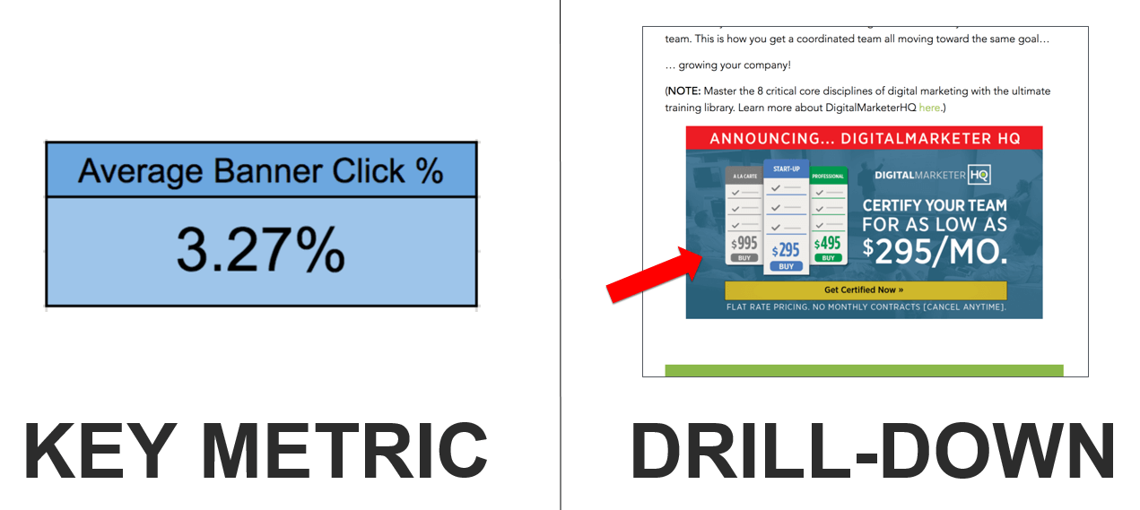
The Average Banner Click % is a key metric. It tells you, across your entire site, how likely it is for a visitor to click on a banner ad in one of your articles.
To help us understand why the click rate is 3.25% and how we can improve that number, we need a drill-down metric: How likely is a visitor to click on a banner ad in one specific article?
Not long ago, we did this for the DM blog. After reviewing all our blog posts and drilling down for specific metrics, we were able to identify the factors that impact the click rate. After applying our findings, we improved the banner ad clickthrough rate by about 2% across the blog.
Improving Search Traffic
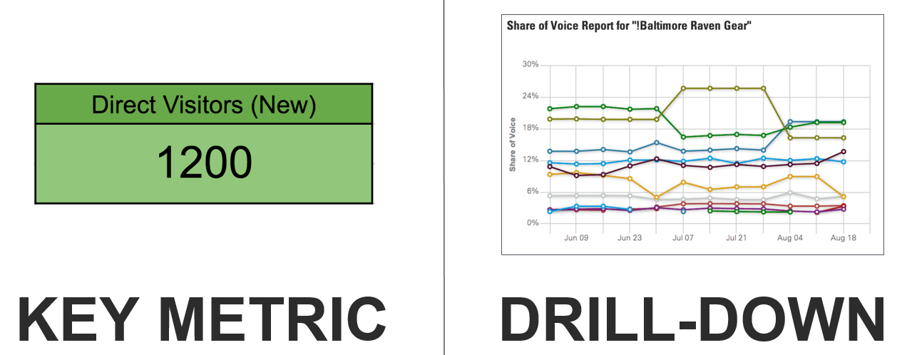
In this example, the key metric is New Visitors: How many first-time visitors are landing on your website?
To learn more, the drill-down metric would be Share of Search: What percentage of search traffic is owned by what person or brand?
Here, you'd compare how much search traffic you're getting for a keyword to how much your competitors are getting from that same keyword. This would allow you to find areas where you can compete with much larger businesses because you own the keyword. Alternatively, it will tell you which keywords you need to put some work into.
Improving Ecommerce
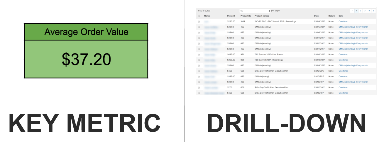
And in this example, the key metric is Average Order Value. To drill down, you'd need to look at actual orders.
You want to know where the bulk of the revenue from your Average Order Value is coming from. This could reveal that you need to move things around in your sales funnel or that you need to push one promotion over another because its average order value is much higher.
As you can see, there are 2 ways you can give your metrics a job.
- You can assign them to a specific stage of the funnel: TOFU, MOFU, OR BOFU.
- You can use them to measure the health of different areas in your business and then answer deeper questions about how and why.
Once you understand the overall health of your business and where things are working (or not), you can begin to use metrics for problem solving.
Principle #2: Using Metrics to Solve Problems
Data is collected on a dashboard, right? But on the dashboard, it's raw data. Your job, as data analyst, is to turn raw data into active data.
For that, you use the analytic decision-making process.
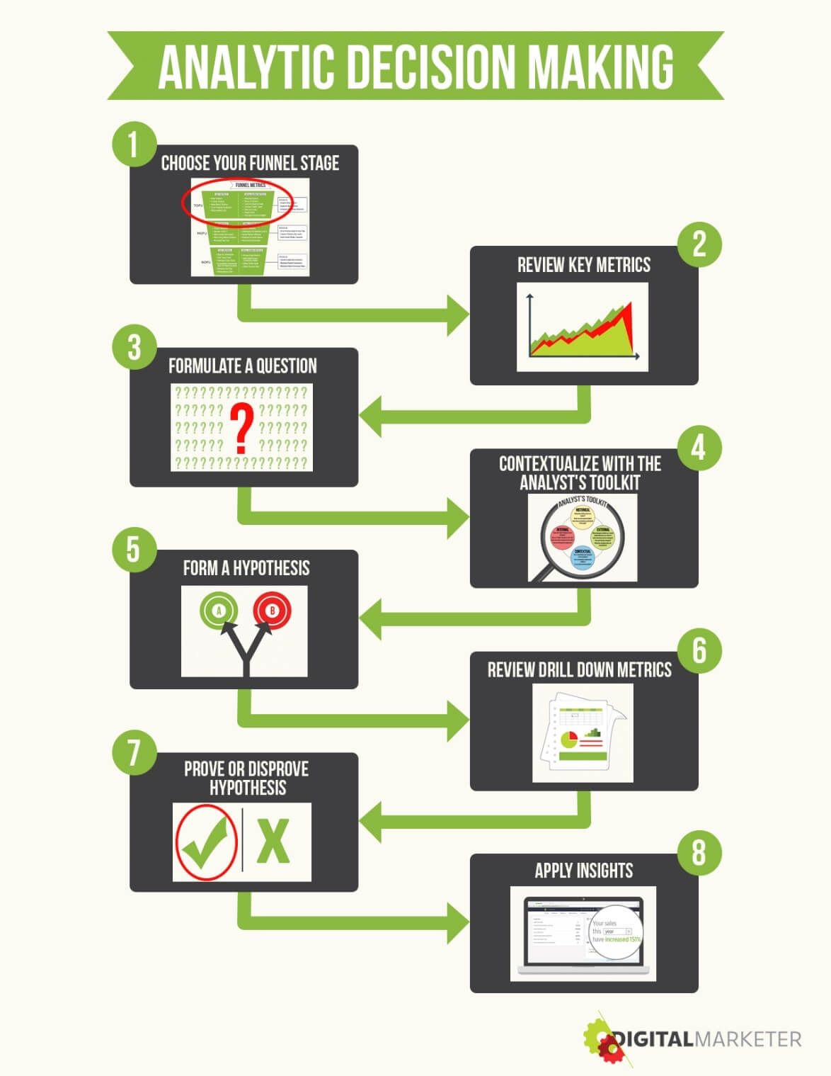
This process works a lot like the scientific method, except it's based on metrics.
In the scientific method, you start with questions and hypotheses, and then you make predictions about what might happen if you test different hypotheses.
It's the same with data and analytics. You review your data and start asking questions about it. You make hypotheses about what might happen if you could impact any of those numbers. And then you devise a test to see if you're right.
Simply by reviewing the results, you can clearly see what needs to be done to improve your business. Making decisions is no longer about your gut instincts, but about what the data is telling you.
That's the theory, anyway.
But in practice, we often don't know enough to know what questions we should be asking. In those situations, it often helps to take another data dive.
Reviewing Key Metrics to Inspire Questions
When you don't know enough to know what you should be asking, your metrics will often give you the insight you need.
Step 1. Start by Reviewing Your Key Metrics. Identify the places where your performance is better than expected or, perhaps, trending downward. In many cases, this will inspire questions.
- This blog post's traffic is double most other blog posts. What made it perform better?
- We're getting new subscribers every day, but our total subscriptions are staying the same. What's happening? Where are we losing subscribers? Why?
- Every time writer SM writes a blog post, traffic and shares are higher than normal. What makes her blog posts better than anyone else's?
As an example, when reviewing the Member's On/Off report for the DigitalMarketer Lab, we saw some weird inconsistencies in the Members Added column.
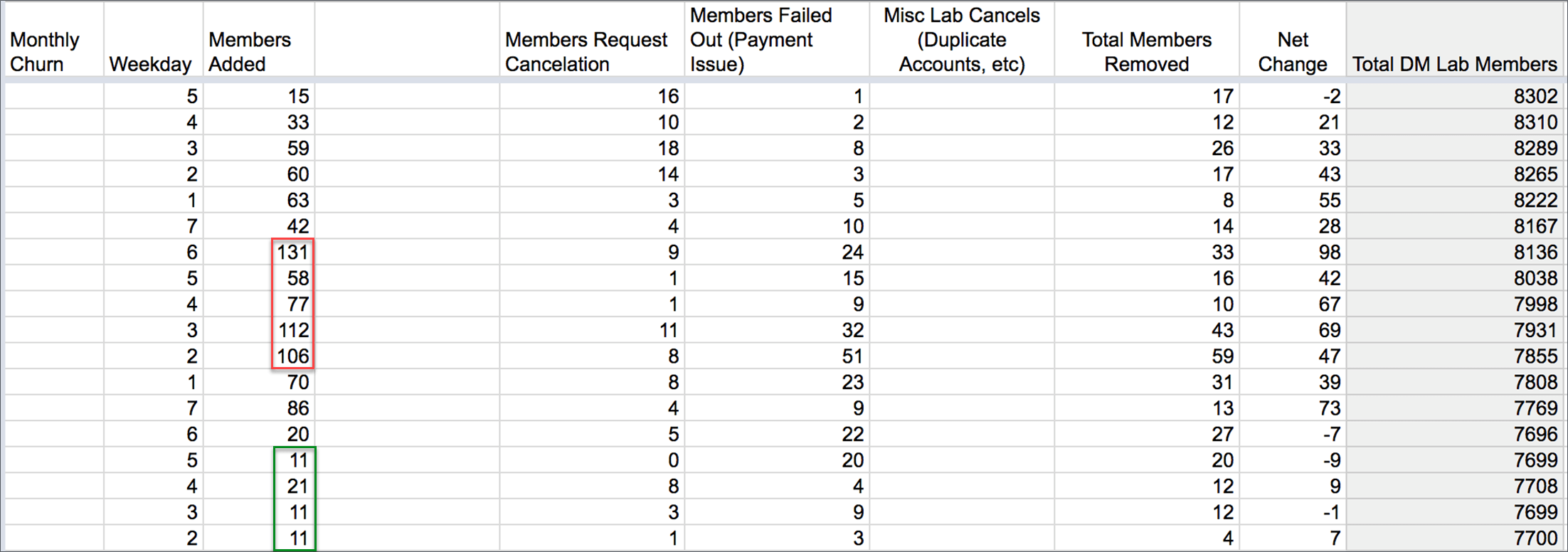
The Member's On/Off report for DigitalMarketer Lab
Some weeks, we'd add 131, 112, or 106 new members. In other weeks, we'd only add 11 or 21. After seeing these numbers, some questions sprang to mind:
- What's causing these spikes in subscriber conversions?
- What's causing these periods of lower conversion?
Step 2. Generate a Hypothesis About What's Happening. Make some predictions about what's going on. For our Member's Added inconsistency, we made three guesses:
- The $1 trial is a better offer because it converts more visitors for all traffic sources.
- The $1 trial churn is higher than that of full-pay members, meaning it doesn't contribute to our goal of growing the lab.
- People keep restarting the $1 trial offer after their time expires, inflating conversion percentages.
Hint: Don't settle for just one hypothesis. It's best to consider multiple explanations—ideally 5 to 7 hypotheses—and test them all. Otherwise you limit your ability to learn what's going on.
You see, in most cases, there isn't just one reason for the issue you're seeing. Several factors may contribute to the success or failure you want to understand. The more hypotheses you have, the better your chances of isolating all the factors involved.
Step 3. Use Drill-Down Metrics to Test Hypotheses. For this, you'll use more detailed, granular data to figure out what's causing the issue you're trying to understand.
This data isn't usually reviewed on a daily basis, but it exists, and you know where to find it. It's also the data that helps you answer these kinds of questions.
For this particular question, we used cohort analyses to test our 3 hypotheses. We developed 7 cohorts, or different ways you could group the people in DM Lab, including cancellation date, average percentage paid, how long they were active, and more.
After reviewing all that information, we realized that the $1 trial was a better front-end offer than the full-pay offer.
Step 4. Take Action Based on Your Findings. The conclusion of our data analysis was that the trial offer generates more paying customers than average. For every 100 people we put into DM Lab, 21 came from the trial, while 20 came from the full-pay offer.
While that's not a significant difference, over time, it can add up. So we changed our front-end offer. The $1 trial offer is now our primary offer, and so far, it's yielded an extra 1,000 Lab members.
Principle #3: Contextualizing Data to Account for the Unmeasurable
It doesn't matter how good your data is, sometimes it doesn't tell you everything you need to know.
For instance, let's say you're reviewing your data and you see a trend. Why is that trend taking shape? Maybe you ran a campaign during that period. Maybe your competitors did something unique. Or maybe you had a technology problem that skewed the data.
If you don't consider these factors when evaluating your data, you're likely to make an assumption based on a false set of data. Your conclusion won't be valid.
In these situations, context helps you account for variances in your data. And there are 4 contexts you need to consider.
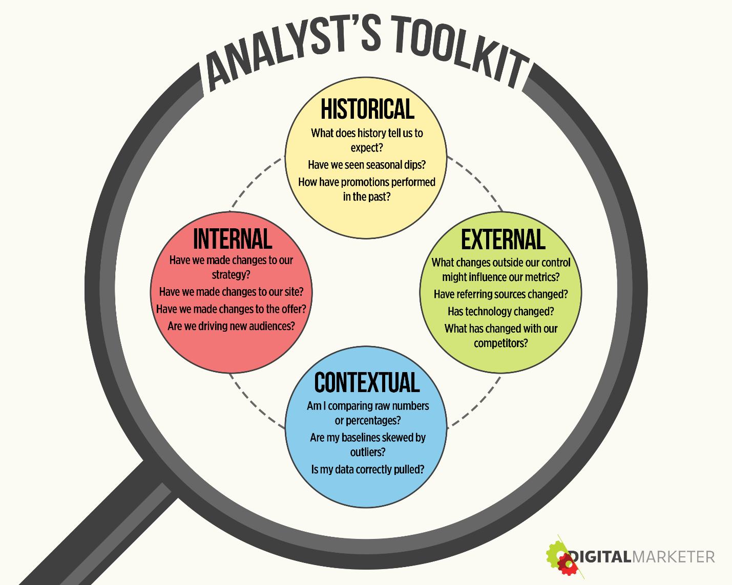
4 contexts help you interpret your data.
Historical Contexts
What does history tell you to expect? By reviewing data through a historical lens, you can understand trends and typical behavior among your customers.
For instance, at DigitalMarketer, we've noted that sales dip in the summer. Consistently. Every summer.
So rather than worrying about lower numbers, we've come up with strategies for boosting sales in late spring. We also reduce ad spend in the summer because we know the ROI won't be as good.
External Contexts
What changes outside our control have influenced our metrics? Maybe a new competitor has entered the market. Or maybe technology has changed, necessitating major changes in the way you do things.
Think Google algorithm updates.
External factors may be outside your control, but you need to keep them in mind when evaluating performance.
Internal Contexts
Have you made changes to your strategy that impact your performance? Have you made changes to your site or launched a campaign?
This is more of a self-review. Think through the changes you've made internally that might have affected your numbers.
Contextual Contexts
This has to do with how you're pulling the data. Are you comparing raw numbers or percentages? Are your numbers skewed by outliers? Do you have data that doesn't make sense because of an internal or external factor?
Together, these contextual factors help you account for the immeasurable things, the things you can't foresee or explain in your data. And they help you evaluable the validity of your data.
Making Data Actionable
As you can see, the 3 principles of well-executed analytics and data can help you turn random numbers into actionable tasks for your business.
You need to assign roles to your data so you know the stage of the funnel they relate to and whether they help you know something (key metric) or give you information to answer a question (drill-down metrics).
You also need to use data to make smarter decisions for your business. Use it to test your ideas about what's working and what's not and how you might improve results. When you review the numbers to answer a question, you know what you're trying to prove or disprove.
Then finally, you need to put your data into context by evaluating the factors that might be driving numbers up or down. By tying data to the real world, the numbers will make more sense and it will be easier to use them in your business to drive growth.
The Lingo Analysts Use
There are 5 terms you must understand to talk intelligently about analytics and data.
Analytical Decision Making
This refers to the data scientist's scientific method. It's the process you'll use to identify the questions you should be asking and the best methods for answering them.
Analyst's Toolkit
These are the tools, templates, and resources you'll use to turn concepts and ideas into data and reports. Your toolkit will help you ask the right questions and develop a process that makes data analysis easier.
UTM Parameter
This refers to the code you can append to a URL to give you more information about where your traffic is coming from.
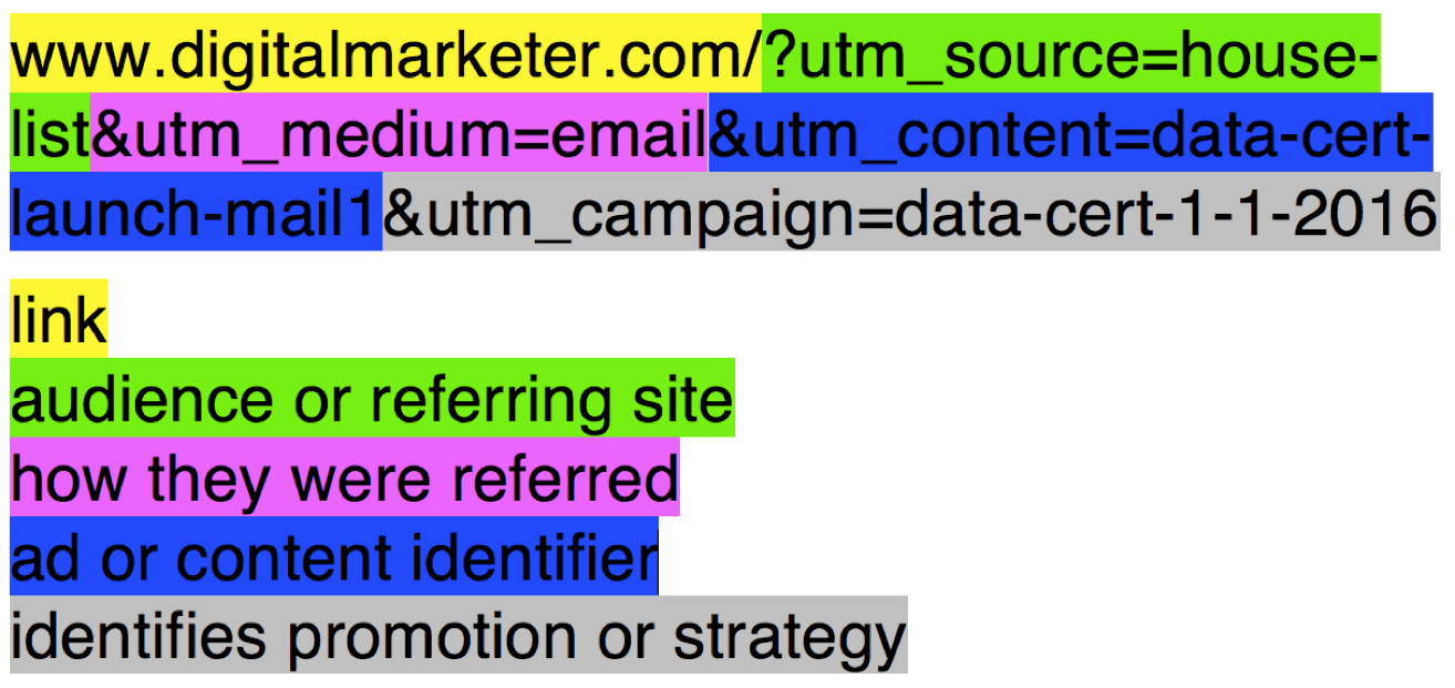
How to use UTM parameters
In this example, the yellow highlight shows you the actual link. Everything after that is a UTM parameter. It's this extra information that helps you track your traffic sources.
- Green highlights the source, which tells you the audience or referring site (house list).
- Pink highlights the medium, which tells you how this traffic was referred (email).
- Blue highlights the content, which is your ad/content identifier (data cert launch email1).
- Gray highlights your campaign, which identifies the promotion or strategy this traffic came from (data cert 1-1-2016).
When you add UTM parameters to your links, anyone who clicks on those links will be tagged, and you can track those tags in Google Analytics.
This allows you to see which sources and communications are giving you the best traffic.
Key Performance Indicator (KPI)
KPI is another way to refer to a metric in general, and it's usually used to talk about a metric that someone thinks is driving their business. KPI is another way to talk about a key metric.
Dashboard
A dashboard is a web page that collates your metrics from a particular source. You'll likely have a dashboard for each data source: Google Analytics, your email service provider, your social media platforms, and more.
Most dashboards also provide graphs that turn your data into visuals, making it easy to see how well you're performing.
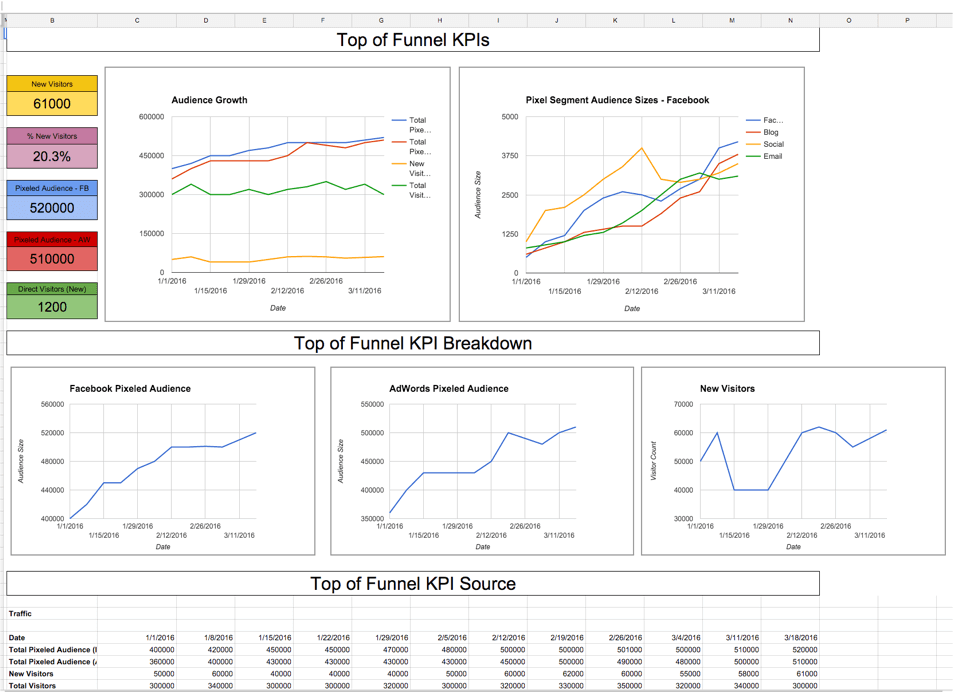
Dashboards give you at-a-glance understanding of what's working.
Dashboards should be available to everyone on a team. They help you easily understand what's going on in a business, which helps team members see how their work is impacting the success of your business.
The Roles: Who Needs to Be in the Know?
Who should own your business's data? Where in the company does data analysis live?
Data & Analytics
The analytics team (or individual) should have primary responsibility for gathering, vetting, and interpreting your data and analytics.
Larger teams may also have a data implementation manager, who aggregates all this information and turns it into a beautiful dashboard that's easy to understand.
Marketing
Every marketer worth their salt needs to know a little about analytics and data. Whether you're running Facebook campaigns, tweeting 50 times a day, or posting articles to your blog, you need to know what's working and what's not.
Conversion Rate Optimization (CRO)
The people who run tests to optimize your marketing rely heavily on data to develop their hypotheses, set up tests, and measure performance.
Summing Up
Analytics doesn't have to be scary or overwhelming—even if you're not a numbers person. You simply need a process for dealing with the numbers, a way to figure out which ones will help you identify opportunities and which ones to ignore.
Once you've got your process in place, you may actually find you enjoy analytics. There's no better feeling than knowing without a doubt that your marketing plan is working—and it's the metrics that will give you that confidence.
We're nearing the end of our digital marketing overview. The next (and final) lesson is conversion rate optimization, which is a simple process for improving your marketing results over time.
Honestly, conversion rate optimization, or CRO, as it's often called, is the secret sauce for your digital marketing strategy, and you'll love how it focuses your energy on the tasks that matter most.
Become an Analytics & Data Specialist
Data and analytics are essential to a modern digital marketing strategy—and they're key to growing your business.
To succeed today, you need to master the 3 principles covered in this chapter and develop an effective process for organizing all your data, evaluating it, and turning it into smart business decisions.
DigitalMarketer's Analytics & Data Specialist Mastery course gives you the training you need to:
- Build a compete analytics dashboard that reveals the overall health of your company in one glance.
- Turn raw numbers into meaningful action, using an 8-step flowchart that guides you step-by-step through the process.
- Identify the traffic sources that are most valuable to your business, so you get the best possible ROI from your marketing.


